Brand Identity
Kapari
Client: Kapari · Year: 2026
A complete brand built from scratch by The Whale Creative for Kapari — an evening bar with its own house beers, signature cocktails, and small plates. Name story, handwritten logotype, color and type system, linocut illustrations, menus, beer labels, packaging, merchandise and signage: every piece designed in-house, end to end.
Services
- Brand Strategy
- Naming & Story
- Logo Design
- Visual Identity
- Illustration
- Packaging
- Menu & Print
- Merchandise
Overview
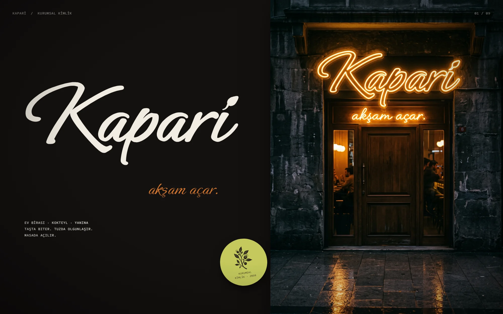
Kapari is a brand we built from nothing to the last napkin. There was no existing logo, palette, or guideline to extend — The Whale Creative designed the entire identity end to end: the positioning and story behind the name, the handwritten logotype, the color and type system, the illustration language, the menus, the house-beer labels, the takeaway packaging, the merchandise, and the neon over the door. Every surface a guest touches was drawn in our studio.
The Challenge
Bars compete in a crowded visual space: chalkboard clichés, generic craft-beer badges, and interchangeable "industrial" aesthetics. Kapari needed a personality that felt made by hand rather than bought from a template — warm but unpretentious, playful but disciplined — and a system strong enough to carry three very different products (house beer, signature cocktails, small plates) without splitting into three brands. It also had to respect the legal limits on alcohol communication in Türkiye, so the identity could live on a street façade and a t-shirt without ever turning into advertising.
Our Approach
We started from the name. The caper plant grows out of cracks in stone walls, thrives on salt and stubbornness, and — a detail we verified botanically — its flower opens at dusk and fades by morning. That single fact became the tagline, "akşam açar." (opens at dusk), and the metaphor that runs through the whole brand: stone, salt, thorn, evening. Every name, line of copy, and visual decision was pulled from that world.
Logo — A signature, not a font.
Kapari's logotype is a handwritten script, drawn and weighted so it reads like a signature scrawled on a bar tab. The dot of the "i" is a caper bud on a short stem — a detail most people find on the second look, and never forget after.
The mark was built as a single vector shape so it can be screen-printed on a paper bag, embroidered on a cap, bent into neon, or stamped at 22 millimetres on a receipt without losing its character. We defined its clear space, minimum sizes, and the only four backgrounds it is allowed to sit on.
Color & Type — Paper, charcoal, and one loud accent.
The palette is ordered by role, not by taste: paper and charcoal carry the brand, a burnt orange and a caper-green take turns as the single accent, and olive steps in where contrast needs support. The rule is simple and strict — no more than three colors on any surface, no pure white, no pure black, no gradients, and a grain of paper on everything.
Three typefaces, three jobs: the script is reserved for the signature, a condensed grotesk shouts every heading in capitals, and a monospace handles ingredients and receipts in lowercase. Every face was checked for full Turkish glyph support before it was allowed in.
Illustration — Carved, not rendered.
Two linocut motifs give the brand its texture: a flowering caper branch for menus, napkins and shirts, and a caper plant hanging from a stone wall for beer labels and signage. Both are single-color, deliberately rough at the edges, and designed to be rotated, cropped and repeated into patterns for bags and wrapping paper.
House Beers — Four beers, one wall.
We named and dressed Kapari's four house beers from the same story: Duvar Dibi, a clean lager named after the foot of the wall where capers grow; Tuz Çiçeği, a salty gose and the brand's flagship; Diken, a pale ale with a thorn; and Kömür, a porter for when the night gets darker.
Each can shares one template — the hanging caper motif, the logotype, a condensed name and a single handwritten line — so the range reads as a family on the shelf while every beer keeps its own color.
Takeaway & Print — Every order leaves with the brand.
The takeaway system turns a practical necessity into a brand moment: burnt-orange kraft bags, foil wraps printed with the logotype, aluminum trays sealed with a receipt-style label, and a closing line stamped at the bottom of every order — "Tuzun eksik olmasın" (may you never run short of salt), a Turkish table blessing rewritten for Kapari.
Stickers, napkins and order labels complete the set, each one designed as a small piece of print you would want to keep.
Merch & Loyalty — A brand guests take home.
The identity extends to cream tees printed with the manifesto — "Taşta biter. Tuzda olgunlaşır. Masada açılır." (It grows on stone. It ripens in salt. It opens at the table.) — embroidered caps, and coasters that carry small lines of house wit, including one that reminds guests a glass of water goes well alongside.
The loyalty card, Müdavim, rewards regulars with food rather than drinks: a deliberate choice we made to keep the brand fully within Türkiye's alcohol-promotion rules without losing any of its warmth.
Results
- A complete, production-ready brand system delivered in a single package: logo files, fonts, illustrations, a written brand voice, identity boards, social-media formats, and photographic mockups of every key touchpoint — designed entirely by The Whale Creative, from the first sketch of the name to the last sticker.
- 20+ Brand Touchpoints
- 4 House Beers
- 100% Designed In-House