Wellness & Branding
MA Space
Client: Gizem Büyükballı · Year: 2026
MA Space is an Antalya-based yoga and wellness studio. A comprehensive identity system reflecting the brand's values of peace, balance, and nature was created, along with a website built for both corporate presence and e-commerce.
Services
- Logo Design
- Website
- Corporate Identity
- Digital Branding
Overview
ma space is an Antalya studio focused on yoga, sound baths and breathwork. We built its visual system from scratch — logo, color, typography, product labels and photography direction — along with a website for both the studio and its boutique products.
The Challenge
The studio had no visual identity yet — no logo, no colors, nothing to build on. And the yoga and wellness space is visually crowded: lotus flowers, mandalas and pastel watercolor washes have become almost a shared uniform. ma space needed an identity that wouldn't get lost among those patterns — calm, but with a personality of its own.
The experience the studio offers isn't one-dimensional either. Alongside yoga practice there's sound and breathwork, the simple act of coming together, and a line of boutique products. The identity had to feel equally calm on a class schedule, an Instagram post, a product label and an online store page.
There was also a bridge to build between the physical space and the digital channel: a guest walking into the studio and a customer buying a product online should meet the same brand.
Our Approach
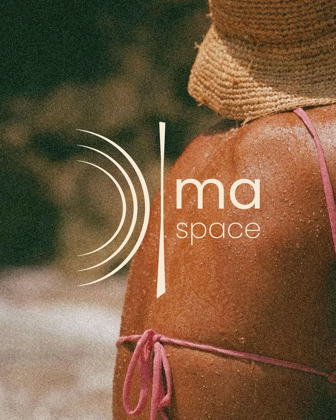
The logo is built from two simple elements: three thin, nested arcs and a vertical line beside them that tapers toward its ends. The arcs can be read as spreading sound or the wave of a breath; the line as an upright body or a threshold. In the wordmark, “ma” is set heavy and “space” light — the name breathes through the balance between those two weights.
The palette comes from nature and skin: a warm gray, off-white, terracotta, deep forest green, a peach-sand tone and cream. Forest green and sand carry the backgrounds, while terracotta is used sparingly as a clear accent. For type we chose Poppins — geometric, legible and with full Turkish character support.
The photography direction leans on grainy, film-like, daylit frames: palm leaves, sunlit skin, an asana in a quiet interior. Images are often presented split into horizontal bands with rounded corners, which gives the brand boards and social posts a recognizable rhythm.
The identity extends to physical products too. On the label designed for the boutique line, the logo sits in cream on a brown ground, with the line “Space for your body. Silence for your mind.” set in a mix of script and capitals. On the digital side, we developed a Next.js website that brings the studio's presentation and product sales together, with content that can be updated from a management panel. Ahead of the launch, a simple “coming soon” page is live on the domain.
Results
- A logo mark of three arcs and a vertical line, paired with a two-weight wordmark.
- A six-color palette and a typography system built on Poppins.
- A photography direction and a banded image layout, applied to brand boards and social media visuals.
- A label design for the studio's boutique products.
- A website for the studio and its online store; a “coming soon” page is live on the domain ahead of launch.
- Creative Director Role
- 2026 Year