Brand Identity
Orange Sound Studio
Client: Orange Sound Studio · Year: 2026
The brand identity built for Orange Sound Studio, a professional audio production studio: a warm, clear, and sincere personality carried by an orange pinwheel mark, a graduated single-hue color system, and a tone built around one idea — "the silence of sound."
Services
- Brand Identity
- Logo Design
- Color System
- Tone of Voice
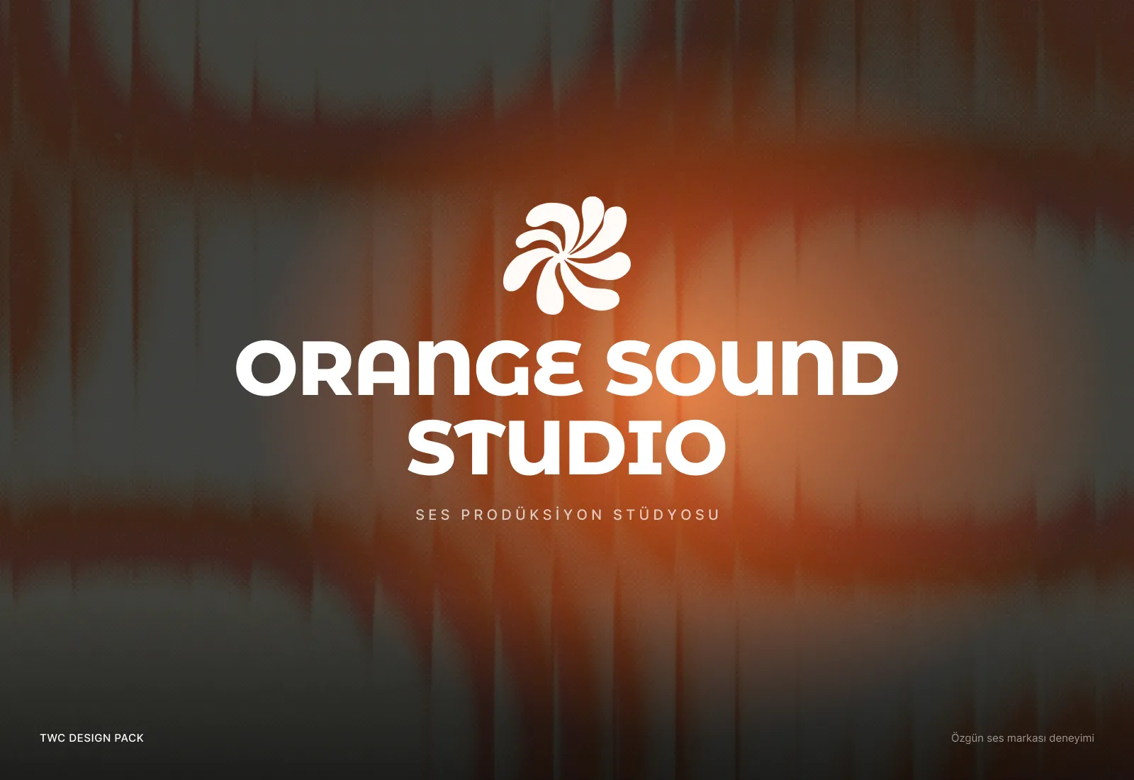
Concept work.
Overview
The brand identity we built for Orange Sound Studio: an orange pinwheel mark made of soft petals, a color system graduated from a single orange, and a tone built on one idea — “the silence of sound.” The identity later carried straight into the studio's trilingual website.
The Challenge
The visual world of audio studios is remarkably uniform: mixing-desk photos, neon gradients, a waveform in every logo. That language describes the industry, but it doesn't set one studio apart from another. Orange Sound Studio needed to talk about a wide range of services — from podcast recording and music production to voiceover and sound design — with human warmth rather than technical coldness.
The brand also had to work across very different surfaces: a social media post, a business card, a dark web interface, the opening seconds of a video. And it would never be able to show its actual product. Sound can't be photographed; the identity had to make you feel it instead. That called for a system tied closely to the name, but not trapped inside a single color or a single image.
Our Approach
We began by reducing the brand's personality to three words: Sıcak, Net, Samimi — warm, clear, sincere. On the first page of the brand book, those three words sit in orange capsules next to the sentence the studio uses to describe itself: a production studio that cares about the warmth and clarity of sound, from recording to mastering, and builds a custom production plan for every project instead of reaching for a template. Every decision after that was tested against those three words.
The mark is a set of soft petals turning out from a shared center. Depending on context it reads as a pinwheel, a flower or sound spreading outward — it suggests movement and vibration without falling back on the waveform cliché. The wordmark is set in a rounded display typeface with alternate letterforms, and the mark and the wordmark work together or on their own.
The color system is built around a single orange. The core orange is graduated in tints from 80% down to 10%, joined by a brighter orange, two browns and a near-black. Warmth never disappears from any surface, while the light tints comfortably handle backgrounds and the dark tones handle text and depth.
For tone and mood we chose “Sesin sessizliği” — the silence of sound: every recording, every mix, every master exists to bring out what the sound can be, and good production deserves to be felt, not just heard. Visually, that idea is carried by analog-feeling photography and grainy orange light images sliced into vertical bands and stretched (a slit-scan effect) — images that suggest a signal stretching through time without ever showing sound itself.
Results
- A core identity defined: personality words, a pinwheel mark and a rounded wordmark.
- A color system built on one orange, graduated from 80% to 10% and supported by a brighter orange, two browns and a near-black.
- A tone-and-mood direction, “the silence of sound,” documented in the brand book with its own imagery.
- An asset package including logo files, a UI kit, a social media kit, brand visuals and short videos.
- An identity that served as the direct foundation for the studio's trilingual website.
- 3 Personality Pillars
- 10 Color Tints
- 1 Core Mark