Brand Identity
Merlger
Client: Ömer Ülger · Year: 2026
Merlger is a bold, futuristic lifestyle apparel brand. A comprehensive corporate identity system was created to reflect the brand's strong and original character.
Services
- Corporate Identity Design
- Futuristic Identity
- Typography System
- Apparel Brand
Overview
Merlger is a bold lifestyle apparel brand that speaks in lines like “Wear what they fear.” In a project covering brand strategy and identity, content production and growth consultancy, we built its visual language — from the logotype to the label system.
The Challenge
Merlger has been around since 2023 and knows exactly what it wants to say. One of its lines puts it plainly: style isn't just for the nights anymore. What it lacked was a visual system to carry that vision — the voice was strong, but the surfaces didn't hold together.
The real challenge was drawing the line between bold and cheap. An apparel brand that wants to provoke can easily end up looking low-end; Merlger had to feel hard-edged and premium at the same time, rebellious but meticulous. And the identity had to speak at the same volume everywhere — on a fashion campaign, a product label, a tote bag or a social media post.
Our Approach
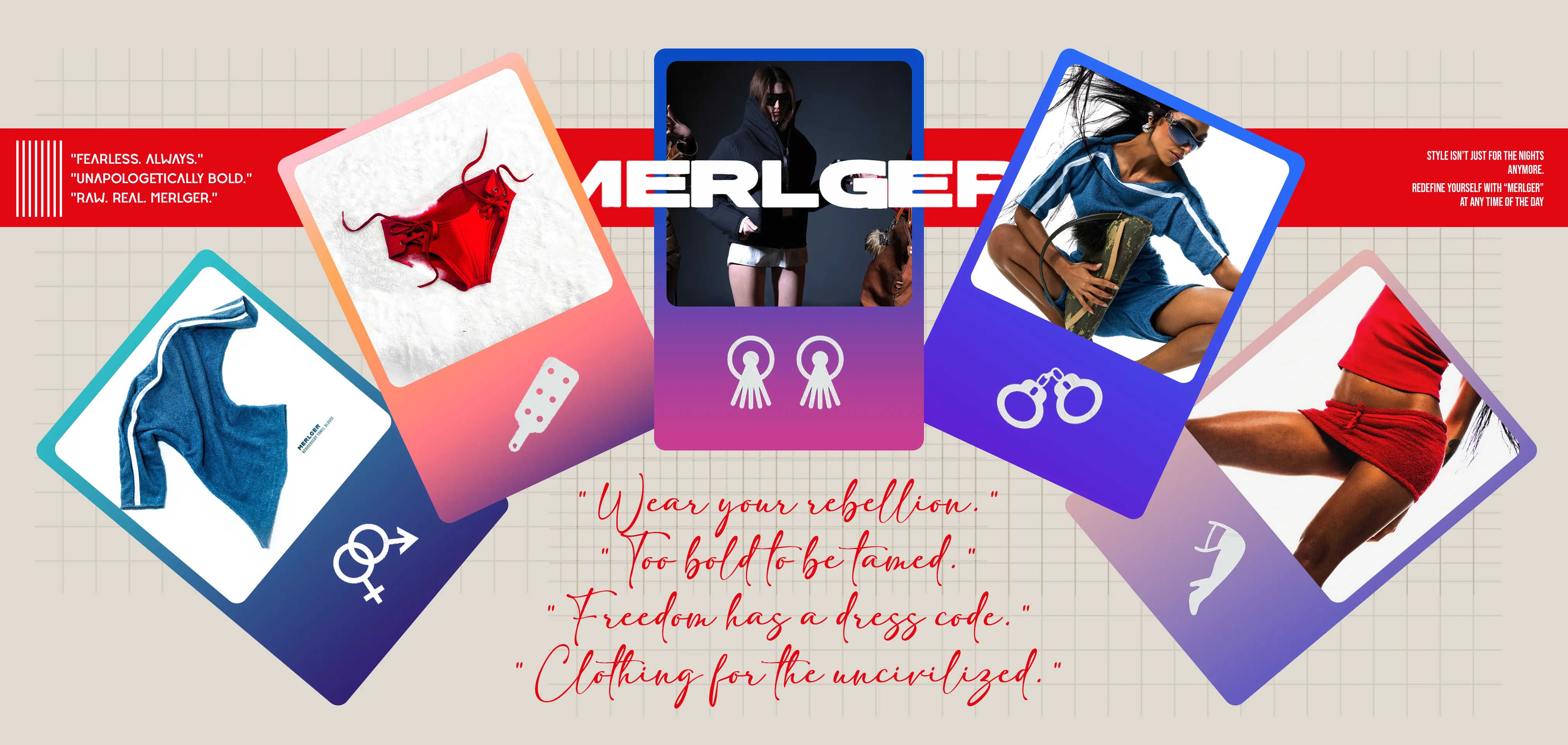
We built the logotype from wide, heavy letters that plant themselves on the ground — MERLGER reads like a poster headline in every application. Next to it sits a short monogram made of reduced strokes, which works on its own on labels, caps and tote bags.
The backbone of the color system is high contrast: signal red (#E30613) and a near-black (#110A08) on a stone-colored ground (#E0DAD1). Electric blue (#2100F0), lilac (#DA9DF7), khaki green (#3B5D29), sand yellow (#EFD48C), steel gray (#5E6D6D) and off-white (#F4F6F7) support that trio; red and blue grounds lead in campaigns, while quieter surfaces stay in stone.
The typography speaks in four voices: geometric Deserta for headings, the Adelia script for slogans, condensed all-caps Bebas Neue for short information lines, and Poppins for body text. When script and hard capitals meet in a single line — “Discover EVERYDAY SOPHISTICATION AND freedom.” — the brand's two sides, elegance and rebellion, show up in one sentence. A fine millimeter grid in the backgrounds makes the whole system feel as if it came straight off a drafting table.
At the center of the applications is a ticket-shaped product label with notched edges. Carrying the logotype, the line “The perfect fusion of elegance and comfort,” a set of single-color icons from the brand's product world and the slogan “Style isn't just for the nights anymore,” the label moves with the same structure onto tote bags, campaign visuals and colorful card sequences. Manifesto lines — “Wear your rebellion.”, “Too bold to be tamed.”, “Freedom has a dress code.” — complete the brand's voice in handwriting across the campaign imagery.
Results
- A wide, heavy logotype and a monogram that works on its own.
- A nine-color system, each color defined by its hex code.
- A four-layer type family: Deserta, Adelia, Bebas Neue and Poppins.
- A ticket-shaped product label, tote bag and cap applications, and campaign visuals.
- Brand strategy, content production and growth consultancy delivered alongside the identity work.
- Creative Director Role
- 2026 Year