Logo & Corporate Identity
The Bold Way
Client: Sercan Sevinçer · Year: 2026
The Bold Way is an agency founded by Sercan Sevinçer, who has worked in digital marketing and SEO since 2012. A strong, bold, and direction-setting identity was designed for the brand.
Services
- Logo Design
- Corporate Identity
- Typography
- Digital Marketing
Overview
The Bold Way is an agency founded by Sercan Sevinçer, who has worked in digital marketing and SEO since 2012; it brings web, SEO and performance marketing together in a single strategy. We designed the agency's logo, color system and corporate identity.
The Challenge
Sercan Sevinçer had a long track record in the industry, but his new agency didn't have a face yet. Digital marketing agencies tend to show up with look-alike, cold and technical identities: graph arrows, growth lines, safe shades of blue. The Bold Way had to live up to the claim in its own name — boldness — visually as well.
At the same time, the identity had to build trust. Brands hand an agency their growth strategy, their budget and their data; looking bold couldn't come at the cost of looking unserious. And the logo needed to stick at every scale, from a shop sign and a business card to a social media avatar and a pitch deck.
Our Approach
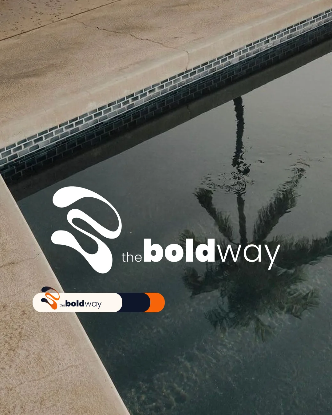
Our starting point was the name itself. In the wordmark, “the” is small and light, “bold” is large and very heavy, and “way” is light but wide. The word “bold” shows its meaning through the typography itself — the logo makes you feel what it says before you've even read it.
For the mark, we turned the initials of The Bold Way, B and W, together with the founder's initial S, into a single fluid form. Curling like a thick ribbon, the lettermark suggests movement and a change of direction; it works alongside the wordmark or on its own — on a round hanging sign, for example, or as a profile picture.
We locked the color rules into a guide. The primary colors are an orange (#FA6404) that carries the energy of the word “Bold” and a deep navy (#0F172A) that gives it weight. Each primary color is defined in HEX, RGB and CMYK, so the right code can be chosen for each print method. Coral (#FE5F53), yellow (#F3D457), blue (#4968AF) and bright blue (#004CFF) were set as backup and background colors for printed products and equipment.
In the corporate applications we kept things restrained: navy printing on textured paper, with the wordmark at large scale and the lettermark in a corner, across vertical and horizontal business card layouts. The cards carry the sentence the agency uses to describe itself: bringing web, SEO and performance marketing together in a single strategy so brands can grow in the digital world.
Results
- A fluid lettermark combining the letters B, W and S.
- A wordmark that tells the name's story through weight contrast.
- Color rules covering primary, backup and background colors, defined in HEX, RGB and CMYK.
- Business card, signage and digital profile applications showing the logo at different scales.
- Creative Director Role
- 2026 Year