Brand Identity & Web
The Whale Creative
Client: (TWC) The Whale Creative · Year: 2026
The Whale Creative was built from the ground up as an Antalya-based creative brand studio and venture studio. The studio's entire visual identity, website, and digital presence were designed from scratch.
Services
- Logo Design
- Corporate Identity
- Website Design
- Digital Branding
Overview
The Whale Creative is an Antalya-based creative brand studio and venture studio. We treated our own brand like a client project, building everything from scratch — from the founder's hand-drawn whale mark to the color system, the website and our digital channels.
The Challenge
A creative studio's own identity is its first portfolio piece. We couldn't recommend brand-building to clients while our own brand looked generic — but the studio was brand new, and there wasn't a single visual element to start from.
The second challenge was range. The studio works across branding, social media, video production, photography, web and venture projects. The identity had to hold all of that under one roof while keeping the same character in each. And there was the question of roots: as a studio founded in Antalya, on the Mediterranean coast, we wanted to tell that local story without flattening it into a generic “agency” look.
Our Approach
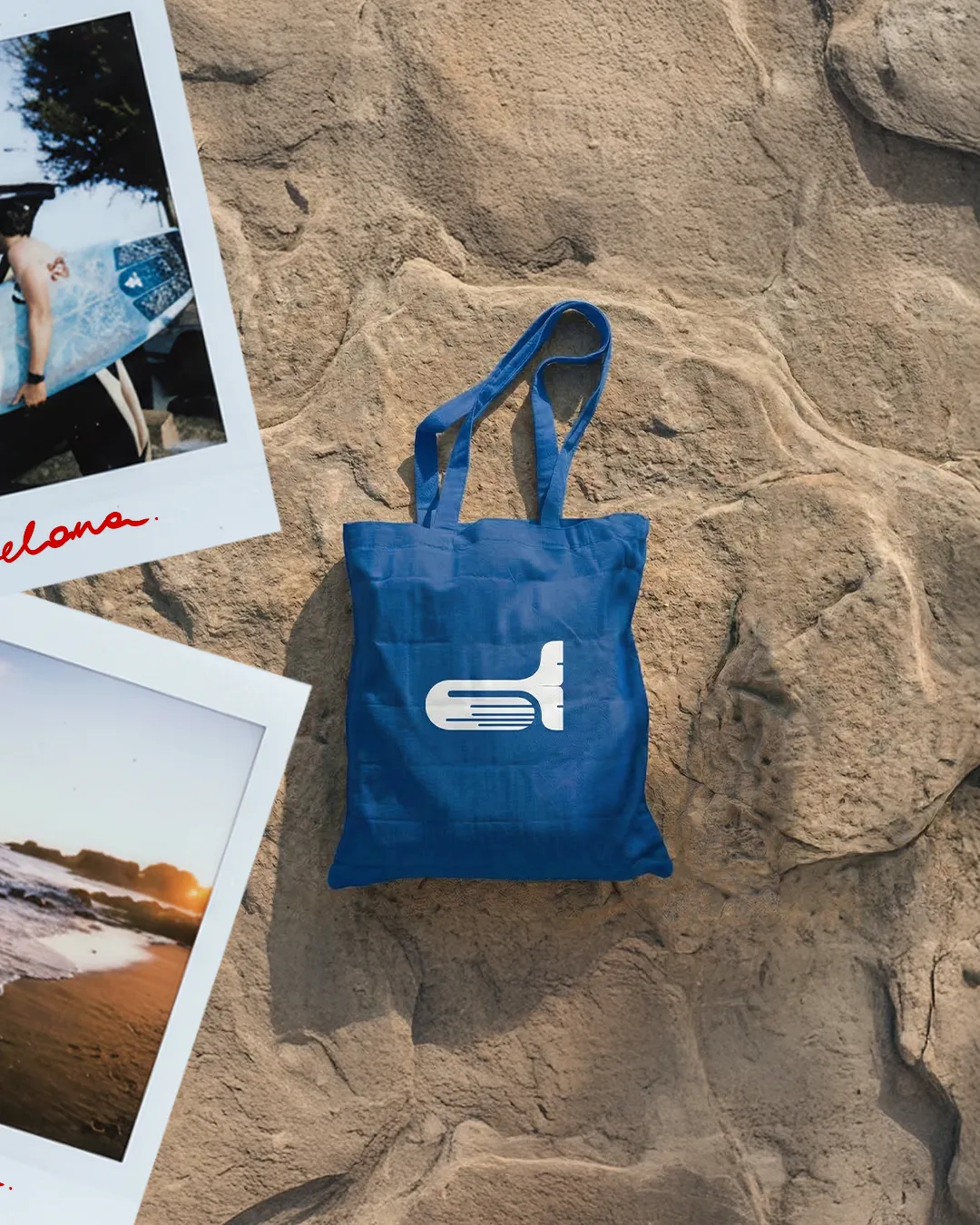
The mark began as a hand drawing by the studio's founder. The whale is drawn as a simple, blocky form, with horizontal lines running the length of its body that recall both the grooves of a whale's belly and a trail of motion. We wanted a mark that stays legible in one color, at small sizes and even on fabric — the cap and tote bag applications were part of that test.
The two lead colors are Whale Lime (#D9E658) and Whale Blue (#2100F0): one carries energy and attention, the other depth and trust. They're completed by tones taken from Mediterranean earth: charcoal (#363438), cream (#F2EADB), terracotta (#B95B3C), mustard (#E1A855), a sea green and off-white (#F4F6F7). We presented the palette on top of an old map of Antalya — the colors also say where the studio comes from.
The photography direction grows from the same root: sand, sea foam, sun-warmed stone and polaroid frames that feel like film. The identity lives on real objects on a real shoreline in daylight rather than in glossy studio shots.
We also designed and developed the website from scratch with React and TypeScript. The current version takes its cue from an editorial magazine: every project and every journal article has its own address, everything reads in Turkish and English, and project pages can unfold into long, chaptered case studies when needed. The contact form and appointment scheduler send email directly, and the site is live with meta tags, a sitemap and robots.txt in place for search engines.
Results
- A whale mark and logo system derived from the founder's hand drawing.
- A color palette and typography system that pairs Whale Lime and Whale Blue with Mediterranean tones.
- Applications such as caps and tote bags, and a shoreline photography direction.
- A Turkish and English website, designed and developed in-house, where every project and journal article has its own address.
- A contact form and appointment scheduler connected to email, with the site configured for search engines.
- Creative Director Role
- 2026 Year